
Google Native Vertical Tabs vs Side Space - Which One Is Better for Power Users?
Chrome finally shipped native vertical tabs. Fair enough. It was overdue.
If you keep a ridiculous number of tabs open, the old horizontal strip has always been a pain. Titles get chopped off. Pinned tabs pile up. After a while, everything turns into a row of tiny mystery icons. Moving tabs to the side fixes a lot of that. You can actually read what’s open again.
That part is good.
But here’s the real question: does better tab visibility actually mean better tab management?
Not really.
That’s where Google Native Vertical Tabs and Side Space part ways. Chrome’s feature cleans up the UI. Side Space is trying to solve something bigger: how you organize work in the browser when your tabs are tied to projects, research, planning, and half-finished thoughts you need to come back to later.
So if you’re choosing between them, the short version is simple. Chrome’s native vertical tabs are great if you just want a cleaner tab strip. If you want your browser to function more like a workspace, Side Space is playing a different game.
What Are Google Native Vertical Tabs?
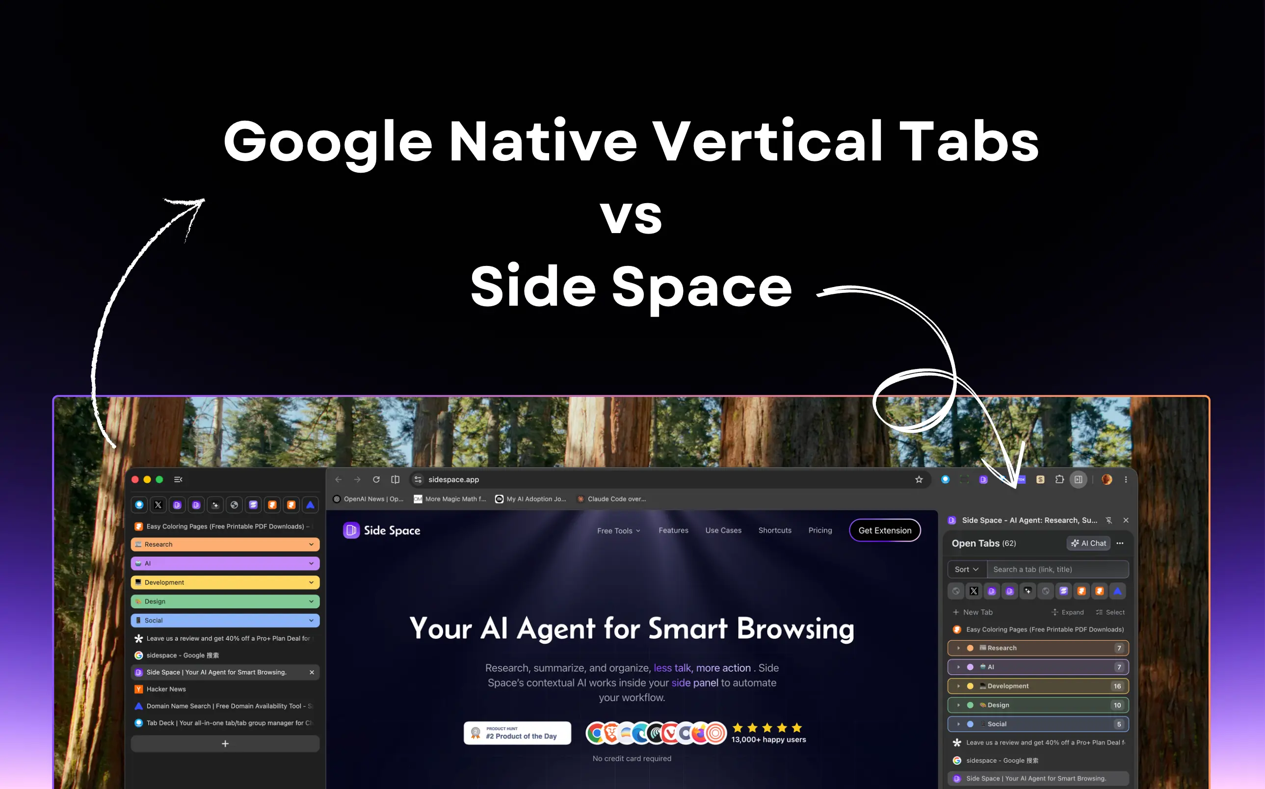
Google Native Vertical Tabs is Chrome’s built-in way to move tabs from the top of the browser into a vertical list on the side.
Why people like it:
- tab titles are easier to read
- large tab sets are easier to scan
- tab groups feel less cramped in a vertical layout
- widescreen monitors usually have spare width, not spare height
- you get more room for the actual page content
So yes, native vertical tabs make Chrome nicer to use. No argument there.
And Chrome has some obvious advantages:
- it’s built in
- it’s light
- there’s basically no setup
- in supported versions, it can hide the top tab bar more cleanly than extensions can
If your problem is just, “I’m tired of squinting at tiny tabs,” native vertical tabs might be all you need.
Side Space vs Google Native Vertical Tabs: Quick Comparison
| Feature | Google Native Vertical Tabs | Side Space |
|---|---|---|
| Primary Goal | Better tab visibility | Better project and browser workflow organization |
| Setup | Built into Chrome | Requires extension install |
| Hide Top Tab Bar | Yes, in supported native versions | No, limited by Chrome extension APIs |
| Tab Groups | Yes | Yes |
| Sorted by Drag & Drop | Yes | Yes |
| Workspaces / Spaces | No | Yes |
| Save Tabs for Later | Limited | Yes, including Save All Tabs to Space |
| AI Grouping | No meaningful workflow layer | Yes |
| Open Tabs Context | Basic tab list | Chat with open tabs and richer context workflows |
| Group Collapsed/Expand | No | One-Click to Collapsed/Expand |
| Browser Actionability | Minimal | Higher, with agent-style workflows |
| Best For | Users who want a cleaner tab strip | Power users who want a browser workspace |
What Side Space Is Actually Trying to Do
Side Space starts from a different assumption.
Chrome treats tabs as things you need to view more clearly. Side Space treats tabs as messy fragments of ongoing work. That sounds subtle, but it changes everything.
With Chrome’s native vertical tabs, you still have one running list of open pages. It’s easier to scan, sure. You can group things. You can collapse some stuff. But the browser still revolves around a tab list.
Side Space pushes the sidebar toward something more useful: a place where tabs belong to contexts, where sessions can be saved, where projects stay separate, and where browser state is not just visible but workable.
That’s the difference. One is a layout improvement. The other is a workflow layer.
Visibility vs Organization
This is the core distinction, and honestly, most comparisons miss it.
Native vertical tabs solve a presentation problem. The horizontal strip gets ugly fast, so Chrome moved tabs to a place where they scale better.
Side Space solves an organization problem. Seeing 40 tabs more clearly is nice. Knowing which ones belong together, which ones are worth keeping, and which ones belong to an entirely different project is what actually matters.
That’s why this isn’t really “built-in vs extension.” It’s more like better tab display vs better project structure.
Tab Groups vs Actual Spaces
Chrome gives you tab groups, which are useful. But tab groups still live inside one big browser context.
Side Space goes further with Spaces. That matters more than it sounds.
If you’ve got one cluster of tabs for work, one for trip planning, one for shopping, one for reading, and one for whatever rabbit hole you fell into last night, Chrome’s tab groups help you label the pile. Side Space helps you separate those worlds.
That’s a much cleaner mental model.
You’re not just sorting tabs. You’re switching contexts.
A Sidebar That Does More Than Mirror Tabs
Chrome’s native version is intentionally minimal. That’s part of its appeal. It doesn’t try to become a whole productivity system.
Side Space absolutely does.
Recent updates push it well beyond basic vertical tabs. Depending on how you use the browser, that may be exactly the point. Some of the features that matter here include:
- AI tab grouping
- Save All Tabs to Space
- Chat with your open tabs
- browser-side agent workflows
- group collapse / expand
- file support and richer browser context
- multilingual support
- better workspace reliability
At that point, comparing the two only through the lens of “vertical tabs” starts to feel a little outdated.
Chrome gives you a better place to put tabs.
Side Space tries to help you work from them.
Built-In Simplicity vs Workflow Depth
There’s a reason plenty of people will still choose Chrome’s native feature.
Built-in tools feel cleaner. They’re easier to trust. They usually use fewer resources. And if your needs are basic, native often wins by default.
But power users rarely stay in the “basic” category for long.
The moment you want to save a working set of tabs, switch contexts quickly, auto-group open research, or use AI on top of what’s already open, native vertical tabs start to feel thin. Not bad. Just thin.
That’s where Side Space has a real edge.
The Catch: Chrome Still Controls the Top Bar
This is the part worth saying plainly.
Because of Chrome’s extension API limits, extensions like Side Space can’t truly remove the original horizontal tab bar the way Chrome can natively. So if you use Side Space, you usually end up with the Side Space sidebar plus the built-in top tab bar still technically there.
For some people, that’s annoying enough to kill the whole idea.
For others, it’s a tradeoff they’ll happily make because the extra organization is worth it. A lot of users just ignore the top bar or tone it down visually with a cleaner theme.
Either way, this is a real native advantage for Chrome. No point pretending otherwise.
Where Side Space Clearly Wins
If your browser is where real work happens, Side Space is stronger in a few important ways.
1. Project-based browsing
Native vertical tabs help you manage what’s open. Side Space helps you manage what the tabs are for.
2. AI-assisted organization
Chrome gives you manual organization. Side Space can help group and structure tabs in a smarter way.
3. Saved workspaces
Chrome is mostly about the current session. Side Space is better when you need to return to a set of tabs later without rebuilding it from scratch.
4. Actionability
Chrome’s native feature is mostly visual. Side Space is pushing toward interaction: using browser context, not just displaying it.
5. Workflow depth
If you want your browser to feel like a serious working environment instead of a tab container, Side Space is simply more ambitious.
Where Google Native Vertical Tabs Still Wins
To keep the comparison honest, Chrome’s native approach still has some very practical advantages:
- no install required
- cleaner out-of-the-box setup
- lower friction for mainstream users
- tighter browser integration
- better handling of the top tab bar
- enough functionality for people who just want tabs to be easier to read
So no, Side Space is not automatically better for everyone.
If your needs are simple, native is probably the better fit.
If your browser is where your projects live, that answer changes pretty quickly.
Final Verdict
Google Native Vertical Tabs are good. They make Chrome better. They fix a very real annoyance. And for a lot of people, that’s enough.
But they don’t replace what makes Side Space interesting.
Because moving tabs to the side is not the same as turning your browser into a workspace.
If all you want is a cleaner, more readable tab layout, use Chrome’s native vertical tabs.
If you want to switch between projects, save tab sets, group things intelligently, work from browser context, and use the sidebar as more than a visual mirror, Side Space is solving a much bigger problem.
That’s the actual comparison.
Chrome improves tab layout.
Side Space improves how you work.
Try Side Space If Native Vertical Tabs Feel Too Limited
If you tried Chrome’s native vertical tabs and your reaction was, “Nice, but I still lose track of everything,” then you’ve already found the gap.
Use native if you want a tidier tab strip.
Use Side Space if you want a browser workspace.